
February: Spring Pencil Case
It’s that time of year in the Northern Hemisphere, when the mornings start to get a little bit brighter and theres more light in the evenings. The birds are itching to get going with nest building and tiny, tiny signs of spring start popping up everywhere. I love the moment just before everything blooms and the trees don’t have leaves yet but their branches are thick with thousands of tiny stems. I think I spoke last October about how these transitional months are usually my favourite. I love Winter and all the cosiness it brings, but I am so ready to move into the brightness of Spring.
All of this has made me want to have a bit of a pencil case reset - get rid of the cobwebs, have a spring clean - inject a few brighter colours into the mix. My pencil case is also really, really full and I’m starting to find it hard to actually see what I’ve got. So I’m hoping to try and have less in there by the time I’ve finished. Let’s see how we go.

I started by having a look at what I already had in my pencil case and the first thing that I noticed was that there were lots of duplicates of the same colour - particularly in pink and green. I also had quite a lot of dark browns and greys, and as much as I really, really love these, I wanted to make room for some brighter colurs. I did also have a couple of tubes of paint in my pencil case, but I thought I would stick with the pencils, markers and NeoColours as these are usually my go-to pencil case staples.
To make sure I was weeding out any duplicates, I tested similar pencils next to each other and chose my favourite one. This usually is based on one of two things, how it looks and how it feels to use. I also put similar tones close to each other to see how they worked together. I really, really enjoyed the pinks and greens (picture above, bottom right).


Once I had taken out any colours that were duplicates or that no longer felt right. I looked at what I had and decided that what I needed were many more yellows and greens. Then, I started the process again, looking at what my new additions looked like next to the other colours and checking to see if there were any duplicates.
I’ll show you what I’ve included below. Within each palate there is a mix of Tombow brush pens, Carandache Neocolour 2 wax pastels, Derwent Lightfast pencils, Carandache Illuminance pencils, Faber Castel water solutable pencils and Holbein pencils. I think there might also be a Derwent Graphatint pencil in there too…
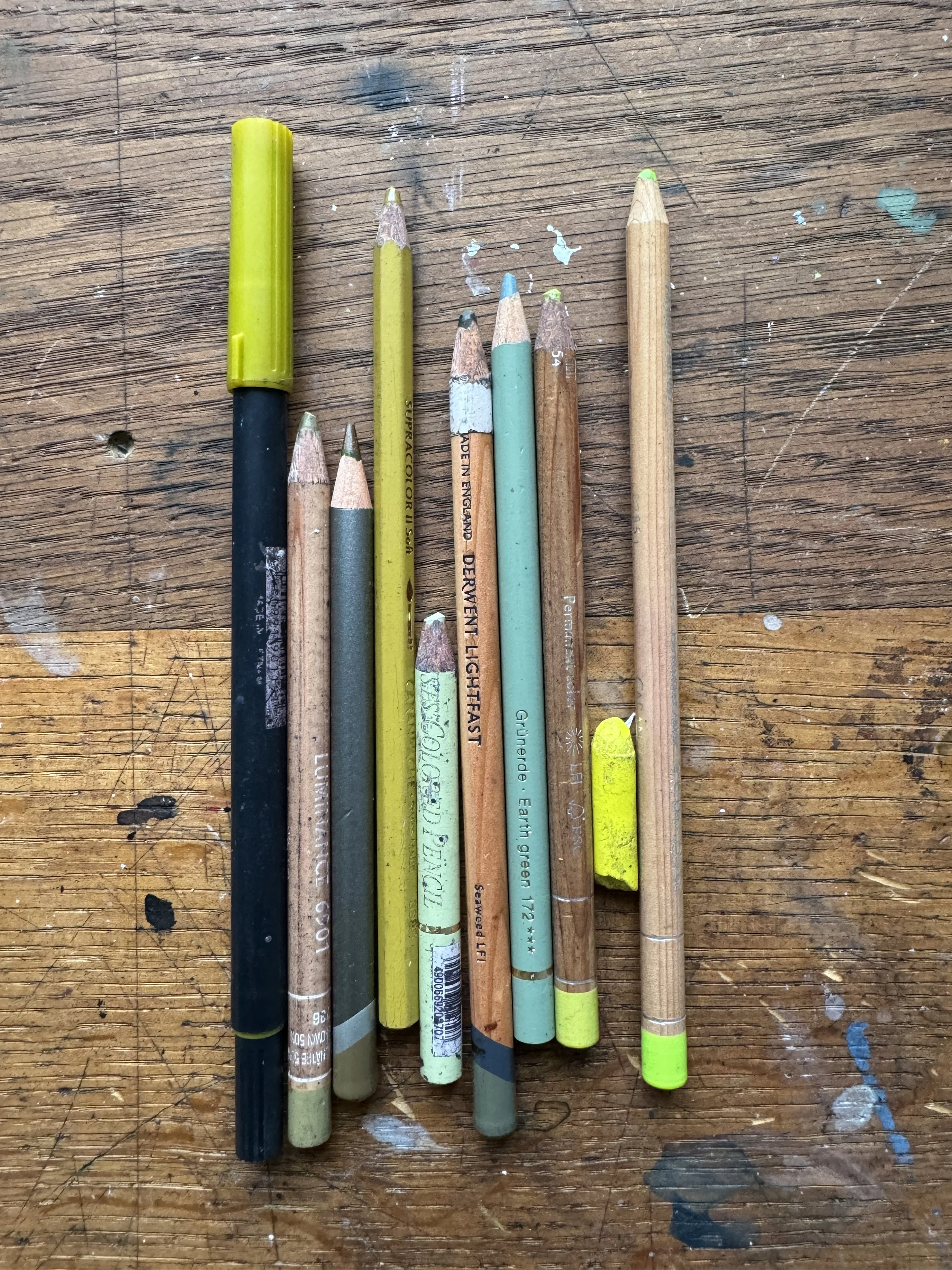
Greens
I already had quite a few darker greens and one lovely olive- yellow green in my pencil case, but I decided that what I really needed was some creamier and fresher greens. A big surprise was the Carandache Illuminance Spring Green pencil that I think I’ve had for years but haven’t ever really used. I really liked it next to Marigold and Luminous Red Holbein pencils.
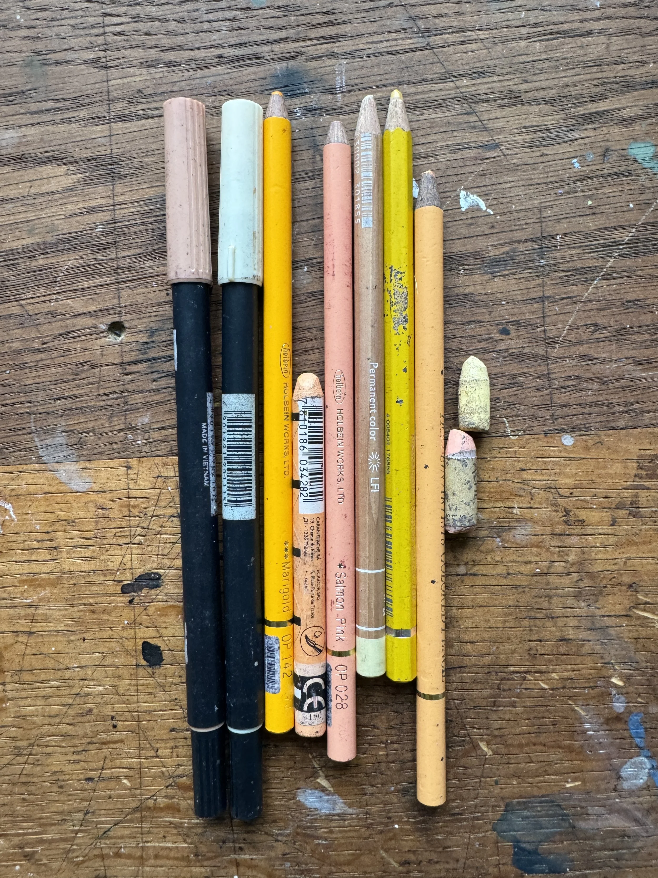
Yellows and peaches
Whatever I did, I couldn’t stop myself from trying to sneak more of the same orangey peach colour into my pencil case. To me, it’s just so beautiful. Especially when its next to that luminous spring green colour that I was just talking about. I did let myself off having almost exactly the same colour in Tombow, Neocolour and Holbein pencil because the textures together were really, really nice.
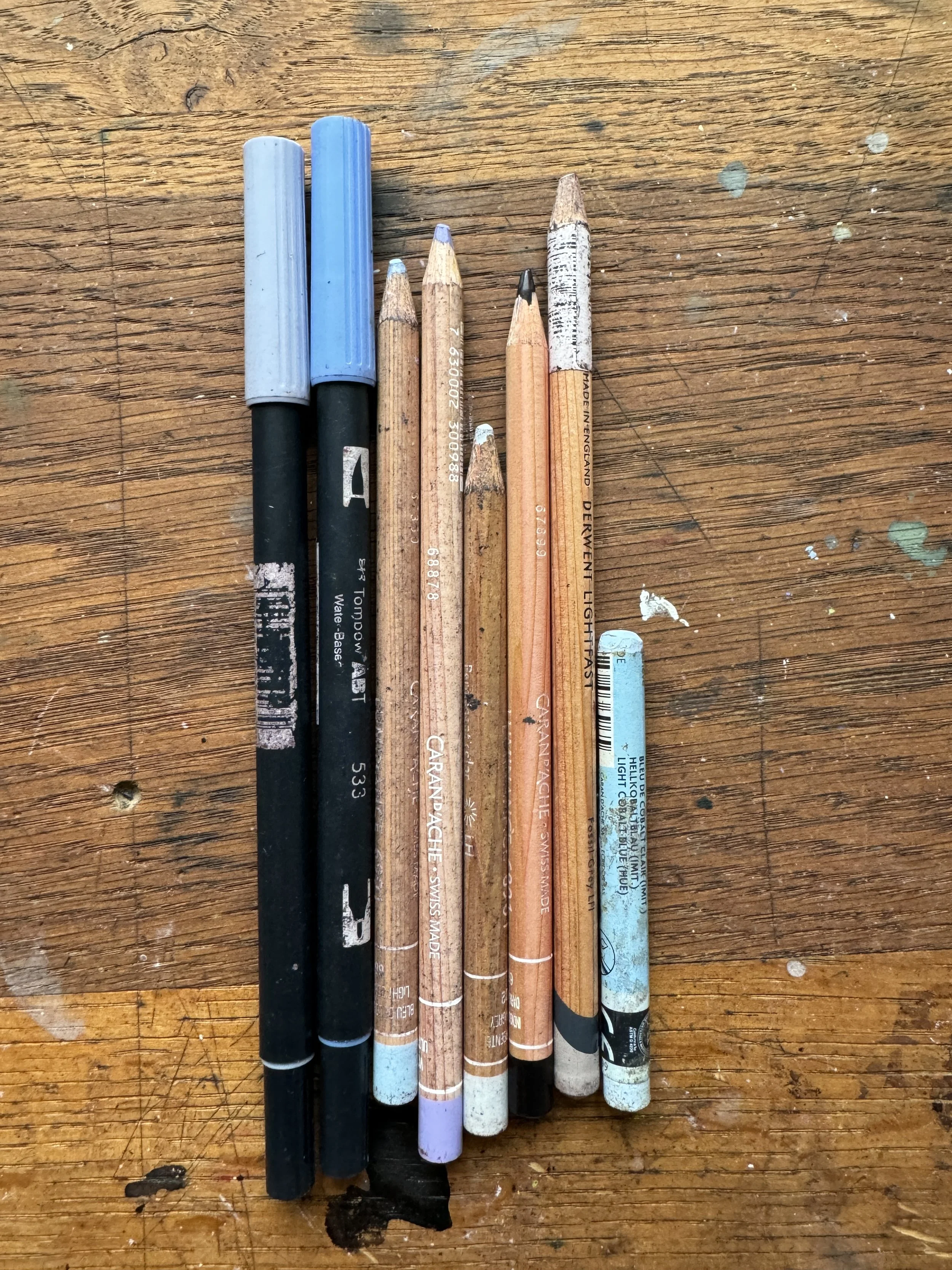
Blues
I took out quite a few grey - blues, but kept these cobalt blues in alongside a few silvery ones. They made me think about really fresh mornings where there’s still that winter bite but the sky is really bright. I also brought a lavender cobalt colour recently. I don’t normally lean towards purple, but I have been really enjoying it next to these blues.

Browns, Pinks and Reds
I really did cut out a lot of deep browns when I was going through what I usually take out with me. I also had quite a lot of the same terracotta red colour. I wasn’t sure about keeping the Holbein Vermillion in with my reds as it didn’t feel very ‘spring’, but I imagined red wellies, red hats and red coats - and I also really liked it next to the Luminous Red.
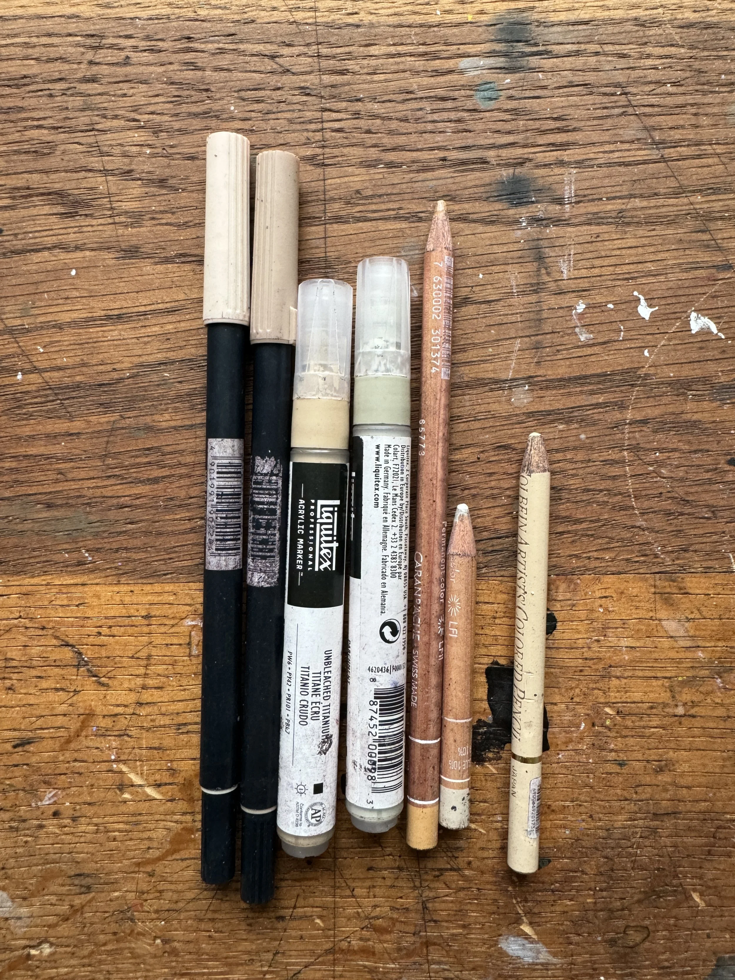
Neutrals
I love a neutral. Always a lovely place to start. Always reliable. Great for drawing the buildings around where I live in the South West of the UK. I think these colours are ones that will always be in my pencil case, no matter the season. This is just because they are so useful and so helpful for when you want to map or block something out.
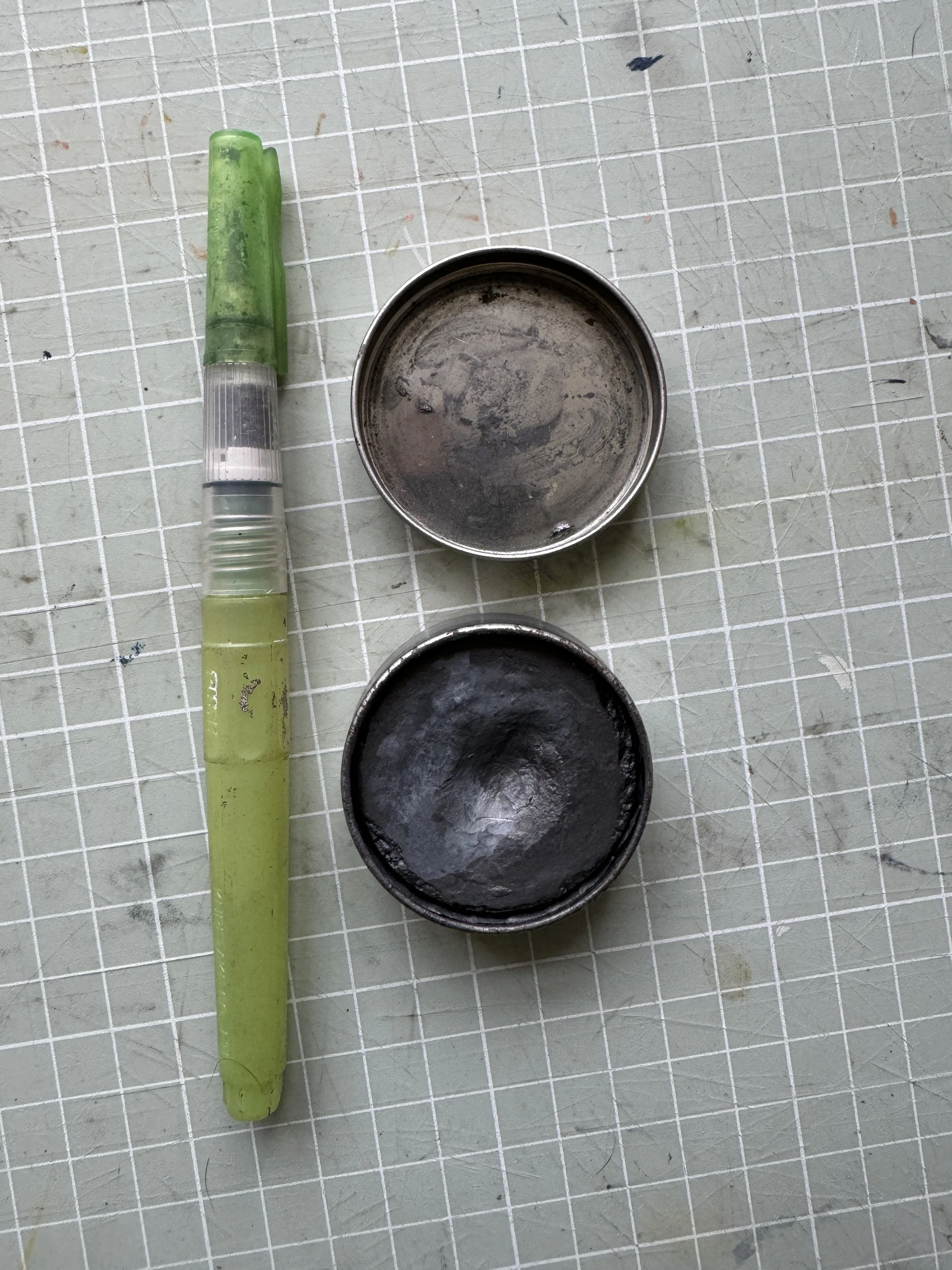
Art Graf Tin
I love this little tin. 10/10 for shadows and shapes and swooshy marks.. I brought it two summers ago after seeing Sarah Dyer talk about it, have used it almost every time I draw and have barely made a dent in the tin.

Here they are all together. Like I said, I often supplement with a few extra paint tubes, maybe some pan pastel or soft pastel - but these materials are usually my staples for drawing when I’m out and about.
If you’d like to know a little bit more about how I work on location and the materials I use, I share a lot more of my process and thoughts over on Patreon. I’ve been really enjoying being able to share a bit more of what I do and make in this way, and I’m so excited to share more as we move into March.

Thank you so much for being here!
I hope that you have lovely months ahead and I’ll see you back here at the end of March.
L xx